If you took any kind of art class growing up, chances are your instructor mentioned the term “color theory.” And that was probably the last time you gave that term any kind of thought. Which explains why a lot of us make arbitrary decisions about color.
When you think of color, you may think of a blue sky, green grass, and black metal music. (Okay, maybe you didn’t think black metal.)
Color is this intangible and visual experience that comes with an emotional response. It is a complex thing when you really think about it. And it can be intimidating to work with.
For whatever reason, thinking about color is my favorite part of the creative process. Maybe it’s the high stakes that come with it: Use color the right way and it will make the experience richer and more vibrant. But use color the wrong way and it will make your eyes bleed.
Not literally, of course, but it will look bad and the world will judge you accordingly.
The ABCs of RGB
Now, I’m sure of a lot of you reading this struggle with how to use color. I did too — still do at times. But once you understand some fundamental rules, working with color will become something you look forward to. Hell, you might even enjoy it. And it doesn’t matter if it’s for graphic design, illustration, or motion design. The same principles apply.
So, today we’re going to cover some basics for how to work with color. Think of it as the ABCs of RGB. And not only will I explain by example, but I will leave you with some handy tips along the way…
Okay, fine. I’ll also include a free download with a bunch of my favorite color resources. Happy? Good.
Now let’s get to work.
What Exactly is Color?
In the simplest terms, color is a sensation. It’s like a smell. We all pretty much agree about how something smells, but it’s a slightly different experience for everyone. In the case of color, we’re using our eyes and not our nose. (I do wonder what purple smells like, though.)
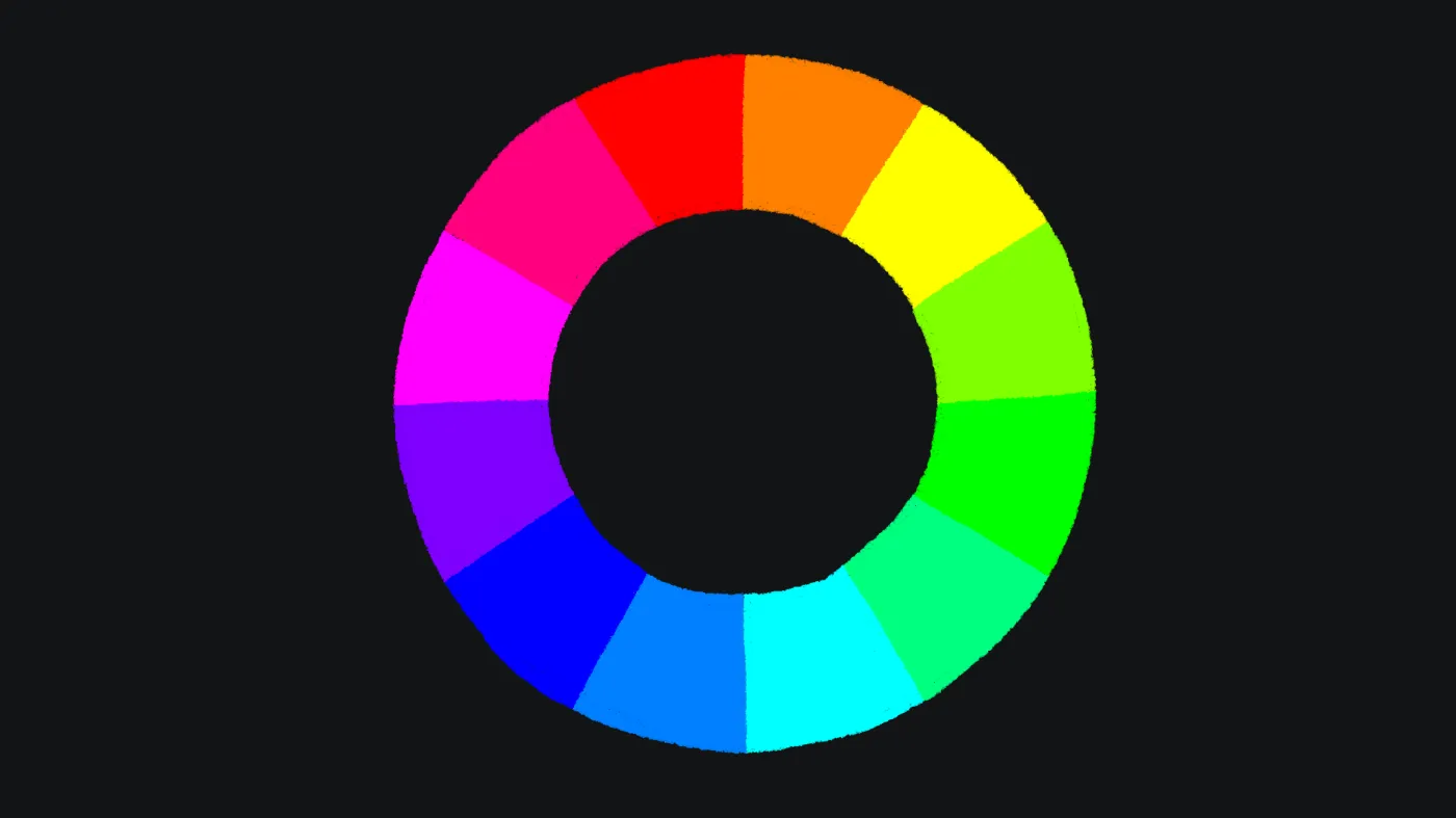
This is the color wheel. It’s a wheel made of, well, colors. Which makes sense, right? The color wheel’s purpose is to illustrate the relationship between colors, and most notably the primary colors: red, yellow, and blue. Remember this wheel; we’ll need it later.
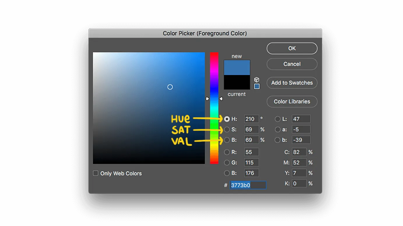
To really know what color is, we need to understand its ingredients. Every color breaks down into three fundamental attributes: hue, saturation, and value. You might recognize these characters from your favorite design app, though sometimes they’ll be referred to as HSB.
These terms might sound all science-y, but they’re easy to understand. I mean, if I can make sense of them, then you’ll be just fine.
Hue
Hue is literally the name of the color that you are looking at. It’s kind of like the clinical term for “color.”
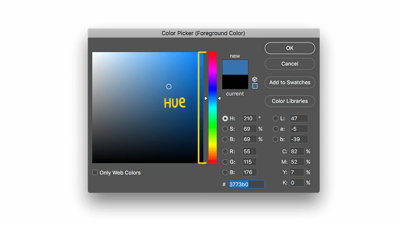
No matter how bright or intense the color is, the hue—the underlying base color—remains the same. Red, Violet, Orange — all hues.
Think of it as the main ingredient in a color’s recipe.
Saturation
The second key attribute of a color is saturation. Think of saturation as the amount of spiciness in a flavor. The more saturated a color is, the more intense its hue. And the less saturated a color is, the closer to gray it gets.
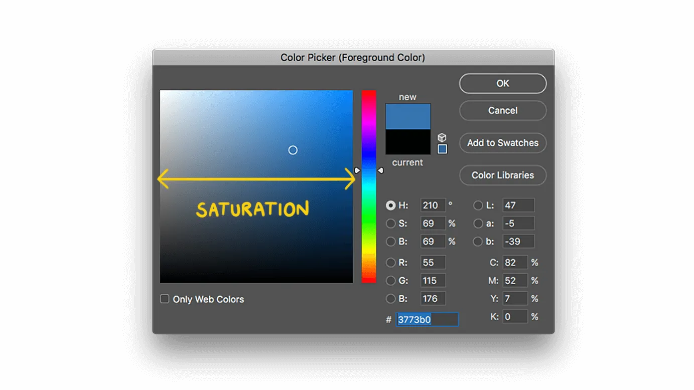
Take a midrange blue, for example. Looks like a regular old blue, nothing suspicious here. But add a bit of saturation and the intensity gets stronger. Add too much saturation and it goes all hyperlink-y.
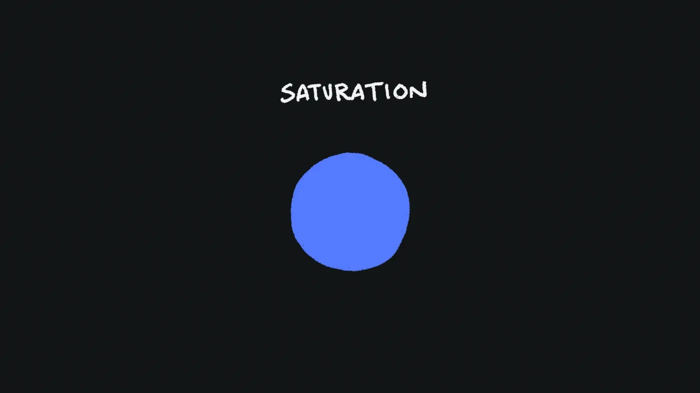
Conversely, if we pull back the saturation we lose that intensity. And our hyperlink blue becomes a cool gray. Neat, huh?
Value and Brightness
The last slice of the color pie is value. Value is basically the brightness of a color. And in most design software (I’m looking at you, Adobe), you will see it called brightness instead value.
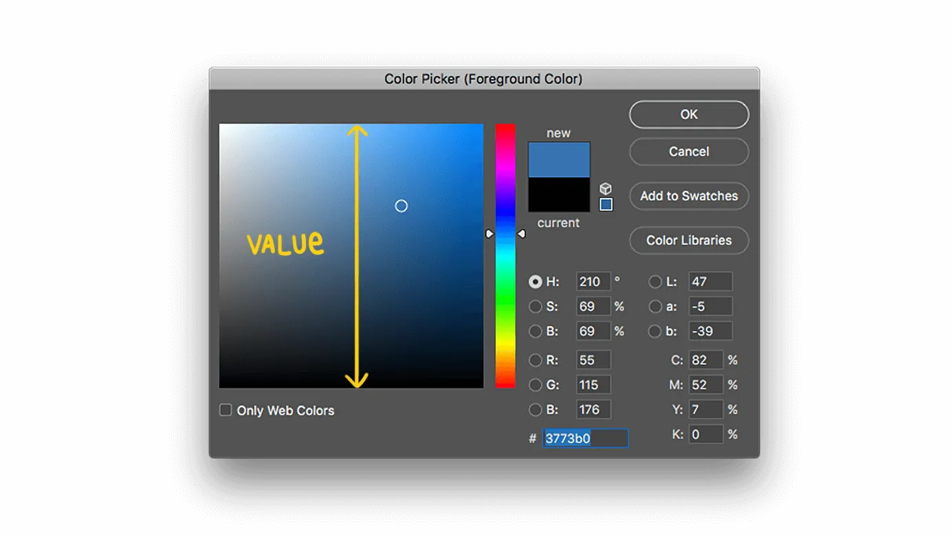
There are two additional terms to describe the value of a color — tint and shade. A tint is a color mixed with white, making it brighter. And you are never going to believe this, but a shade is a color mixed with black, thus making it darker.
Tint = bright, and shade = dark. You still with me?
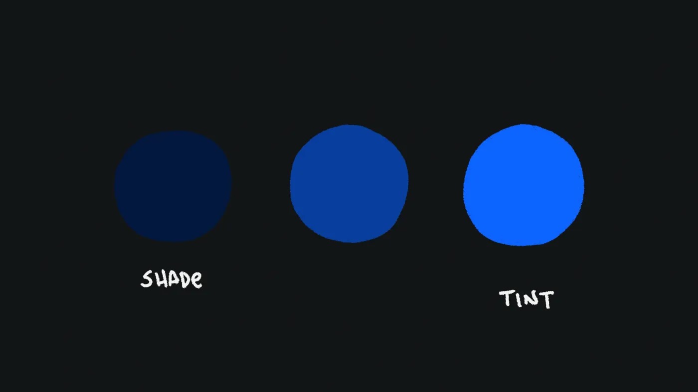
So let’s look at our blue friend again. If we tint it, we’re adding white to the mix, and you will see it brighten. And then, naturally, if we add black, it gets darker. Duh.
The Rules of Color Engagement
So now that you understand the basics of how to define color, you can start to look at it differently. And when you’re in Photoshop trying to find that perfect shade of chartreuse, you will know if it needs a bump in saturation or just some brightness tuning.
Now, you might be thinking, “But Greg, how do I use colors together?” Great question. And rather than go deep into color theory and how to pair colors, I’m going to keep it simple. Take a look at this example:
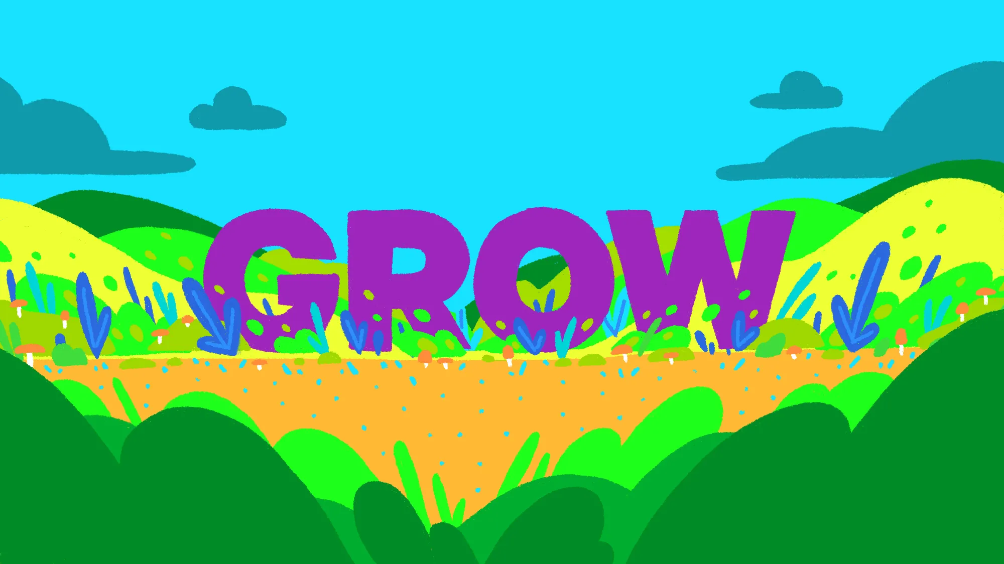
If you’re having trouble focusing and squinting in pain, then I have succeeded. These colors are pretty awful. They’re all over the place and seem to compete for your attention. Your poor eyeballs have no idea what to do with this.
Now, have a look at this version:
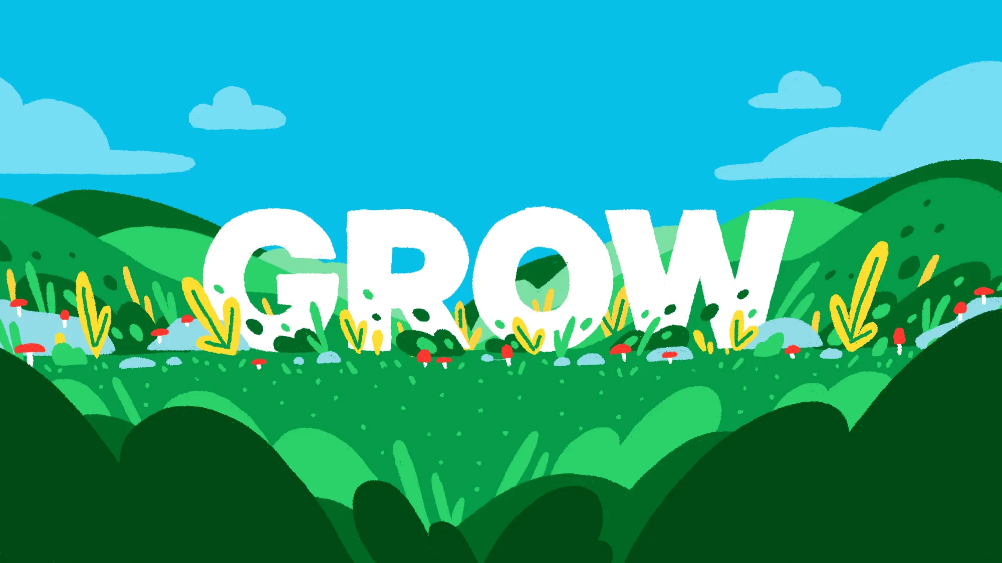
Better, right? Go ahead and wipe the tears of relief from your cheeks. Same illustration, but this one is much easier on the eyes.
But why is that? Spoiler alert: color decisions.
There are some principles at work here that we can learn from. And since I enjoy numbered lists, let’s go over the top three reasons why your color probably sucks.
Three Reasons Your Color Probably Sucks
1. Too many colors
Remember that color wheel? I know, it’s pretty. But unless you’re trying to lead people to your pot o’gold, you probably don’t need to use that many colors.
There’s a reason why black-and-white photos are so universally admired. The right two colors can go a long way.
As a rule of thumb, try sticking with two or three different colors at most. Any more than that and you’d better know what you’re doing because it can get real ugly real fast. If we go back to the cooking analogy, you don’t need to use every spice in the rack.
2. Colors are too saturated
Saturation is another case of a little goes a long way. Overly saturated color gets your attention, like a moth to a flame. But if too many colors in a design are hyper-saturated, it kind of hurts to look at.
Resist the urge to give all of your colors lots of saturation. Think of your color scheme like music — I know, I’m changing analogies on you. You don’t want the volume of every instrument to be at eleven the whole time. You want it to flow. Some parts are quiet, some parts are loud.
Same goes for color.
I like to start in the mid to low side of the saturation scale. What’s interesting about color is that it seems to change relative to what colors are around it. That yellow might look dull over white, but place it over a cool, dark gray and it will pop off the screen.
My advice? Start with less saturation than you think. Then adjust to taste.
3. Too little contrast
The last and perhaps most important point: contrast. Not to get all philosophical on you, but life is all about contrast. You can’t have happy moments without sad ones. And there is no light without the dark.
Color is no exception. When you pair colors together, make sure they have enough contrast. And what that really means is, make sure their values aren’t too close together.
Without enough contrast, your colors are going to fight for your eyeballs’ attention and you will not like what you see. So here’s a quick trick you can use to see how much contrast you have (or don’t have).
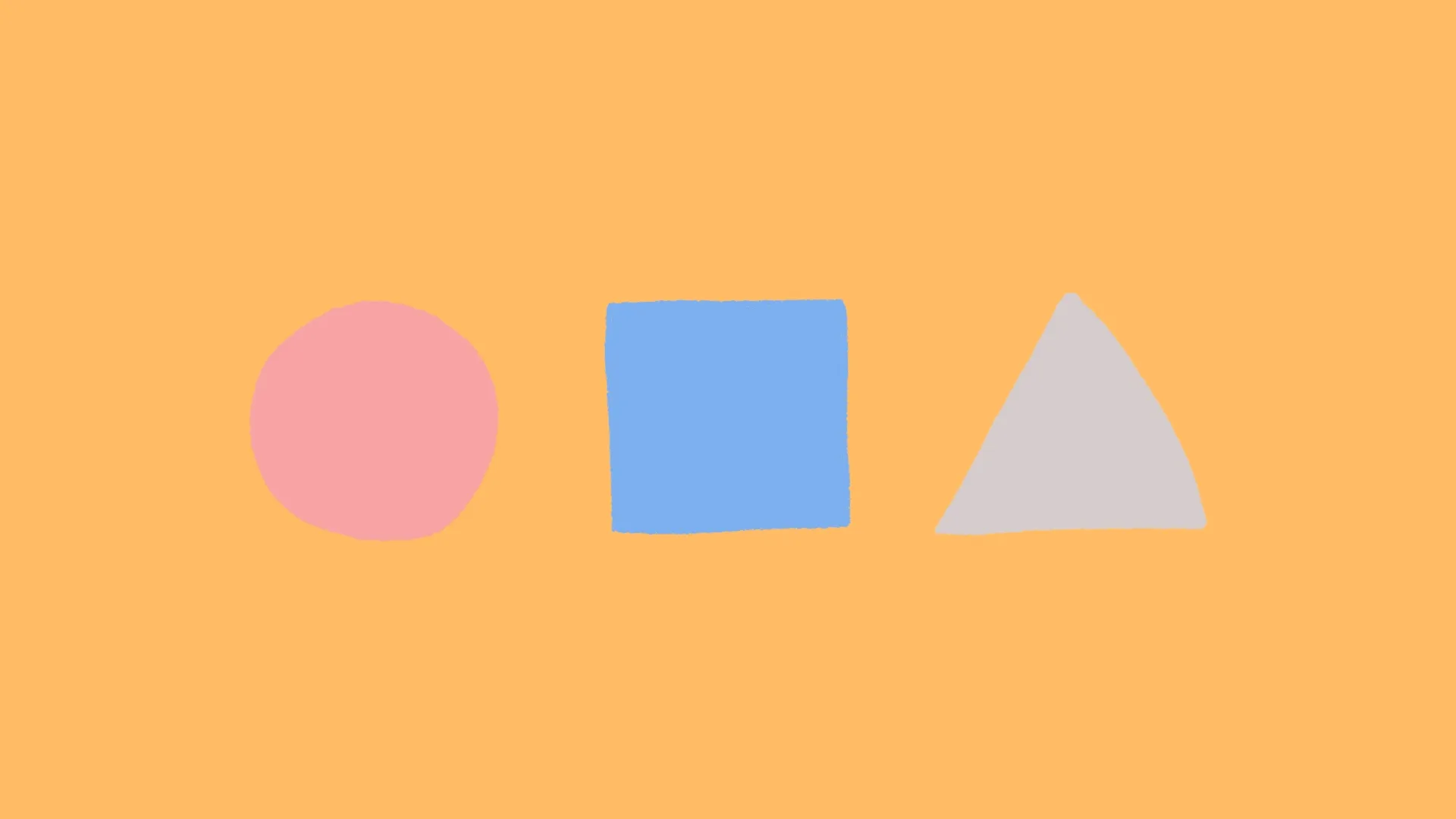
Let’s say you have three colors to work with and you’d like to look at the contrast in their values. Easy — make the image black and white. By removing hue and saturation from the equation you get a clear picture of what’s going on with value.
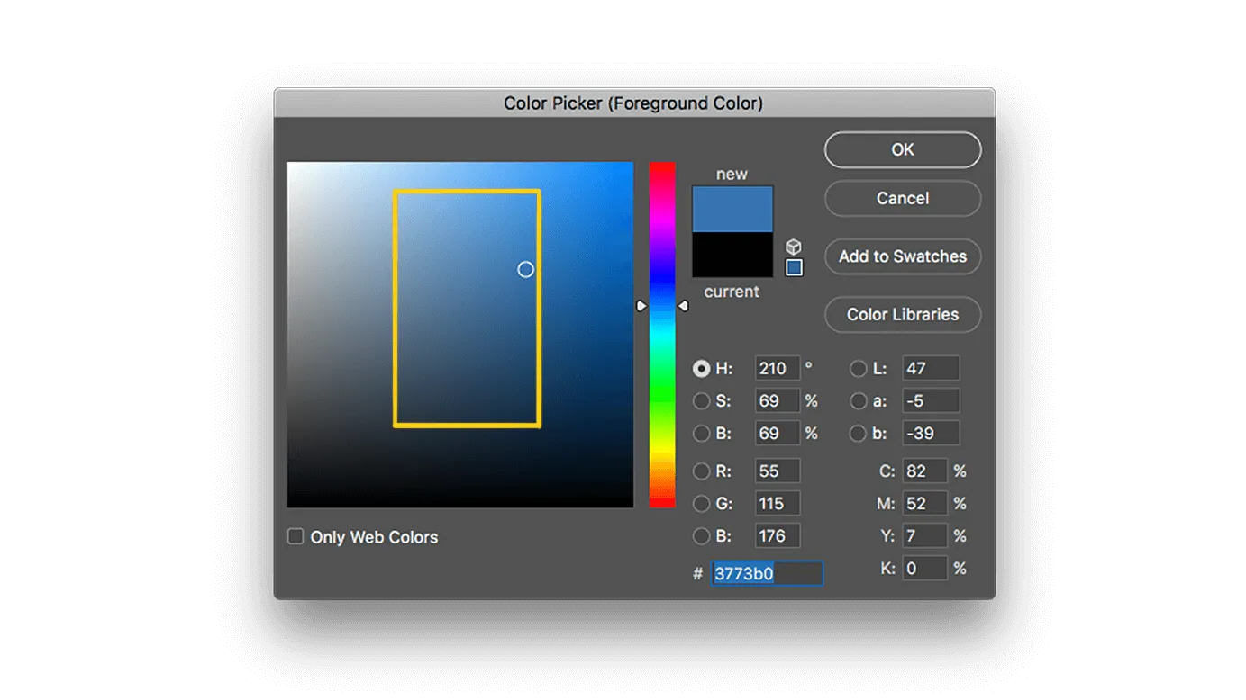
If you’re in Photoshop, simply add a black-and-white adjustment layer over everything. Makes it easy to get a quick value check.
Now, there are other color pairing rules to consider (complimentary, analogous, etc.), but I’ll save that for another time.
Applying Color Theory
Now, let’s put that knowledge to use. Take a look at those horrible colors again:
Yep, still the worst. Let’s change that.
Right away, I know that we have too many colors here. I see blue, yellow, purple, green, and orange — it’s all over the place.
But let’s take a look at the contrast. Using our newly acquired value trick, let’s see what this thing looks like in black and white:
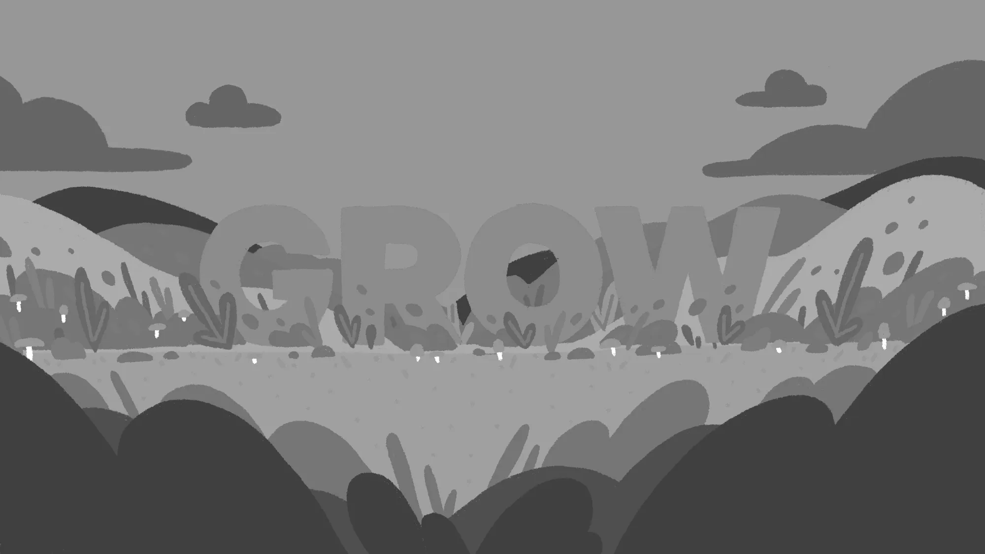
That’s a whole lot of yikes. It’s abundantly clear that most of the colors here are too close in value. It’s like one big gray blob. That’s no good. And it’s probably why we’re struggling to focus on anything.
I also have a sneaking suspicion that at least one of these colors is so saturated it’s neon. That’s three strikes right there.
So now we know what the problem areas are. To get this thing looking halfway decent we need to do the following:
- Simplify the color palette
- Pull back the saturation
- Give the values more contrast
This all makes sense. And given what we’ve just learned, I think we can do it. So, let’s look again at the better version of this image.
I count four colors: red, green, blue, and yellow. Which is better than the five or six we had before. And if you look at the balance of colors, you can see that most of the image is green or blue, with a few accents of red and yellow. Sometimes changing the ratio of color usage can help too.
Now let’s check out the contrast.
What a difference! Before we were looking at an amorphous blob of similar gray tones. But now there is a wonderful range of values. The foreground is very dark gray, the middle lightens up into a medium gray, and the typography just pops out at you.
Even in black and white, this version is leaps and bounds better than the original. That is entirely because of the contrast in value.
Lastly, if we sample a few colors we’ll find that most of them live in the middle area of the saturation spectrum. The red and yellow are more saturated, but they’re also the colors used the least.
The Takeaway
Well, friends, we have reached the end of our internet time together. I hope you’ve gained some confidence in how to work with color. It can be intimidating, but once you understand how to see it, your work (and your life, damn it!) will be that much richer.
Now I have something for you: A collection of all my favorite color resources and tools compiled in one place. Download it for free right here.
If you enjoyed this reading this then you might enjoy my course, Color For Creatives. It’s a project-based course about color theory and how to apply it to your design work.
More Ways to Not Suck at Color
Looking for more color tips? I made some videos about using color with my friends at The Futur that might help: